The purple color is fraught with mystery and incredible charm. What do you imagine when you mention it? The endless lavender fields of Provence or the twilight sky colored by the rays of the sunset, or maybe the delicate petals of lilac and orchids.
The shades of purple are very diverse, and many cannot at first glance determine their belonging. The combination of cold and warm ingredients adds depth, versatility and appeal to the purple tone. It was not in vain that great monarchs and rulers, clergymen turned to him, choosing a color for festive vestments.
Classification of shades
There are 196 shades of violet according to the Panton Standardized Color Matching System. And if you turn to the primary source, you can independently make sure that, despite the absolute similarity at first glance, with a more detailed study, it becomes clear that they are all completely different. It should be noted the poetic names of the shades: purple snow, lavender fog, ice orchid, cosmic sky, crocus, thistle inflorescence, etc.
For ease of perception, we offer you a classification, according to which all shades of purple are divided into 4 groups:
- rich and deep dark purple tones: purple eggplant, plum, dark silk, etc.
- Translucent, light shades: lilac, violet, thistle, pearl purple, amethyst, etc.
- Shades with a red undertone: fuchsia, purple, red-violet, lilac, fandango.
- Shades with blue undertone: electric violet, dark purple, blackcurrant, indigo, etc.
The first group of shades is the most mystical and attractive, their choice is the best way emphasize the aristocracy of the image or interior. If we dilute them a lot, then we get a second palette. It is democratic and easily complemented with other colors. The most capricious shades of purple with a red undertone are considered. They require a classic addition that is light and unobtrusive. We propose to consider in more detail the question of how purple is combined with other colors.
Shades of purple + white

This combination can rightly be called classic. Violet in the presence of white looks noble, catchy and refreshing. Depending on the tone of the first, the strength of contrast changes and, accordingly, the effect of it. It doesn't matter where such a combination is used (in clothes or interior design), believe me, it will be a win-win. Complement it with browns, blacks and grays.
Shades of purple + black

Black, like white, is appropriate everywhere and always, it is universal, and therefore can be easily supplemented with all possible shades. In this case, you need to be careful with purple. Refer to its light shades, especially those that have a red undertone, black will only emphasize their nobility, and do not use too saturated (plum, deep purple). Dilute the ensemble with white.
Purple + gray

This combination of colors is in no way inferior to the first in versatility. Shades of violet on a gray background look calm and comfortable for perception. In the interior, such an ensemble is especially good when decorating high-tech kitchens and living rooms. When choosing a combination of gray and purple in clothes, keep in mind that it the best way suitable for office dress code. At the same time, the first color acts as an excellent base, and the shades of the second add variety.
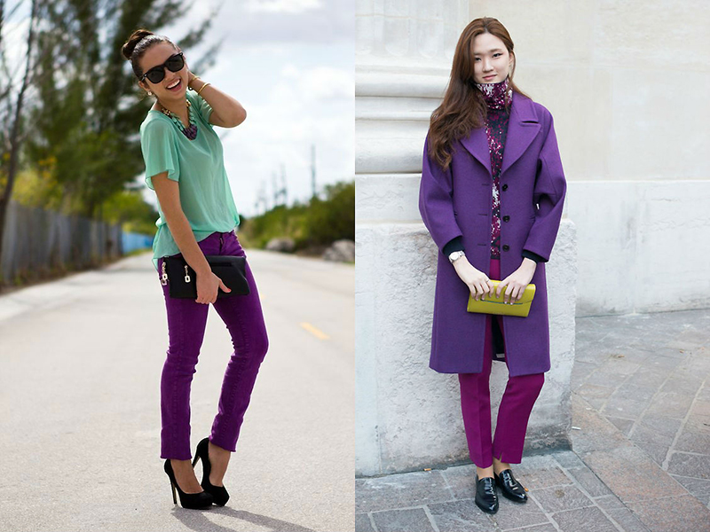
Purple + yellow

Violet and yellow are a gorgeous and vibrant combination, inspired by nature itself. It is for this reason that it is so harmonious for our perception. Give preference to bright or delicate yellow shades, clean, without admixtures of gray and other colors. They will most successfully emphasize the depth of purple and its richness. In this case, there may be completely different proportions.
For interior decoration, a combination of purple and yellow is used, as a rule, when creating a retro style.
If we talk about clothes, then absolutely different proportions are used. For example, a purple dress and a yellow handbag. In the photo, you see an almost equal presence of both colors, but at the same time one of them is inferior in saturation, and this is correct.
Purple + red

The use of both red and purple colors is not just unusual, but rather an extravagant combination. At first glance, it may even seem aggressive and harsh. However, even such an unusual alliance can be successfully beaten. First, we recommend that you use a light violet (lavender, lavender, etc.) with a similar strength of red. Secondly, dilute the combination with a neutral color - white or light beige.
Pay attention to the photo above. The violet-red interior looks very unusual, but at the same time incredibly attractive and atmospheric. It is more of a decoration for something than an everyday option.
Purple + pink
This combination can look vulgar, catchy and tasteless or elegant, light and gentle. It all depends on what kind of shades of purple and pink you choose to complement each other. They are quite close in tonality, and therefore are perceived as something natural. Avoid "poisonous" pink when choosing colors. Give preference to pastel shades of this color, but purple can be rich, deep.
In the interior, this combination is most often used to decorate bedrooms. By choosing clothes in pink and purple, you can create a great summer outfit or even an office look. This combination is also relevant when creating evening makeup... Purple is especially good for emphasizing green and brown eyes.
Purple + beige and brown
The combination of purple and brown is a pleasant, unobtrusive, relaxing combination. When decorating the interior, it will be appropriate in any room (bedrooms, living rooms, kitchens). In addition, brown harmonizes the violet hue in combination with other colors as well as possible, literally "grounding" a bright design and making it more calm.
A similar duet is appropriate for clothing. The image looks especially beautiful where the violet-gray color, or blueberry, is combined with shades of chocolate. Its combination with beige is no less attractive. Purple with such a "companion" becomes more balanced, delicate and light.
Purple + green

These two colors are contrasting and opposite. When they interact, they further enhance each other's beauty and brightness. This combination is more than common in nature. It will look good in any proportion: from rich and deep to delicate and pastel colors. In interiors, mint green and lilac, apple and purple are often used. A bedroom or living room decorated in this way looks stylish and original. But we do not recommend combining green and blue-violet, it is better to use pure shades, without undertones.
Purple + metal (gold, silver)
We have already mentioned that since ancient times, a rich purple color scheme was used for the clothes of emperors and kings. In this regard, the addition of all its shades with something metallic will be very important. These can be large accessories (bags, belts, belts, etc.), jewelry, shoes. The shine of silver and gold will emphasize the nobility of purple hues.

The combination of shades of purple with each other
A combination of shades within one colors is something that everyone can afford. In doing so, one simple rule should be remembered: do not combine cold and warm shades in one set. Well, then - everything is at your discretion.
A complete set in one tone is boring, so combine two, three tones of different saturation. For example, if you choose a deep blue-violet color as a base (suit, dress), then emphasize it with a lavender or lilac cardigan. A blueberry sweater will look great when paired with a light purple skirt or trousers.
Purple is the most alluring and mysterious color, in which the fiery fire of red and the cool smooth surface of blue shades have merged. Such a combination of warm and cold undertones makes purple a very spectacular and incredibly attractive color; it is not for nothing that in ancient times many rulers and clergymen paid special attention to this color. So, if you believe the legends, then purple was one of the most beloved colors of the recognized beauty of the ancient world - Cleopatra, at a later time, purple was very often chosen for their outfits by kings, dukes and other noble persons to emphasize their position in society, as well as create around yourself an aura of a certain mystery and exclusivity. In traditional Chinese painting, purple is the personification of the harmony of the entire universe, so outfits of this shade often look very stylish, feminine and incredibly attractive.
In nature, flowers of purple shades such as lavender, orchid and violet are considered one of the most beautiful and graceful, but at the same time quite capricious plants, for the successful flowering of which certain conditions are needed. So in order for the purple shade to harmoniously fit into any outfit, you should also follow some rules for combining it with other tones, which directly depend on which group of purple colors this or that purple shade belongs to.
So let's take a closer look at what purple is combined with, depending on the specific shade of this amazing color.

Varieties of purple shades and their compatibility with other colors
All shades related to purple can be divided into four main groups:
- : plum, dark purple, purple eggplant and dark silk shades. In principle, any dark purple shades without a pronounced red undertone can be attributed to deep tones.
- Light translucent purple shades: violet, lilac, orchid, heliotrope, amethyst, thistle and pearl purple tones.
- : lilac, red-violet, fuchsia, magenta and fandango.
- Purple shades with bluish undertone: Indigo, Dark Purple, Silky, Blackcurrant and Electric Violet.
Deep deep purple shades are rightfully considered the most attractive and mystical colors that are great for any holiday outfits, and in everyday outfits they bring notes of luxury and aristocracy.
These shades are combined with traditional black and white, dark gray, classic blue and any bluish-purple shades. Dark purple, plum and other deep purples should be combined with golden, wheat, dark lemon, neon pink, raspberry, emerald, bright green, grassy, \u200b\u200borange and coral shades to create unusual, bright and eye-catching combinations. When combining deep purple shades with each other, you should be very careful not to overdo it with the overall color saturation of the outfit. Also, these shades cannot be combined with various prints of other tones, with the exception of geometric combinations of black and white. In any case, you should not combine dark purple shades with several tones, it is enough to limit yourself to one neutral or, conversely, a bright color.


Some of the easiest, both in perception and in combination with any other colors, are light translucent purple shadeswhich are most suitable for spring and summer outfits. The most feminine and sophisticated combinations are obtained by combining violet, lilac and pearl-violet shades with light gray, gray, silver, pink, peach, light green and other delicate pastel tones. All light purple shades go well with each other, with classic white, as well as beige, milky, cream, lemon and brown shades of medium intensity.

What translucent pastel purple shades are combined with: photo

Purple shades with a reddish undertone are some of the most capricious and are combined with a very limited number of colors. These shades go well with any white, milky and light beige neutral tones, as well as not too dark shades of gray, brown and burgundy. Red-violet, magenta and fuchsia cannot be combined with any other bright colors. The exceptions are deep violet and blue-violet shades, in tandem with red-violet tones, they form very bold spectacular outfits that only very brave girls can dare to wear. Calmer reddish purples like fandango and lilac can be paired with classic blues and deep purples, as well as muted greens and pinks.


To create harmonious images based on purple shades with a bluish undertone they should be combined with any neutral, dark green and purple tones, or used in their pure form. Indigo, dark purple and violet "electric" look most impressive in combination with classic white, as well as very light milky, beige and cream tones, but the combination with black is not entirely successful, since it significantly mutes all the charm of violet shades with blue subtone and makes them more than usual. However, to create everyday looks, it is quite acceptable to combine bluish-purple shades with black, which should dominate the outfit. Without exception, all purple shades with a blue undertone are perfectly combined with dark green, malachite, herbaceous, emerald and other not too light green shades. The most harmonious, but at the same time very effective combinations are obtained by combining blue-violet shades with any other violet tones, with the exception of light translucent violet shades.
Recently, I began to notice that in the profile of some magazine owners (or rather, mostly owners), interest in the purple color is indicated. It became interesting what the craving for this color means.
This is what it means
Purple has a wide variety of meanings, such as intelligence, knowledge, religious passion, sobriety, humility, or moderation. In addition, this color means grief, nostalgia, mourning and old age. Purple is best combined with such colors as yellow, white, pink and orange, it is intermediate between blue and red. Light colors of purple are called lilac. They go well with white, yellow, gray and orange colors.
Purple symbolism
Purple serves as a symbol of dignity, grandeur, luxury, melancholy, spirituality and tranquility, humanism and modesty. He is able to make a person want to be filled with feelings and thoughts. loved one... In addition, purple can calm anger, relax, relieve anxiety and irritation.
Psychology of purple
Violet color speaks of emotionality, great sensitivity, spirituality and delicacy of a person. In the event that a person is opposed to such a color, this is a sure sign that this person has a very developed sense of duty and a desire to live exclusively in the present. Purple is the color of very harmoniously developed people (the upper seventh chakra is related to it). However, an overabundance of this color can cause apathy and melancholy. It is associated with great ideas and artistry because purple not only promotes inspiration, but also compassion and sensitivity. This color can help with a variety of negative mental statessuch as neurosis, despair, loss of faith and self-esteem. It is not recommended for severe mental illness, as well as for people suffering from alcoholism.
Purple clothes
Clothes in this range are most often preferred by people who want to achieve inner peace. He helps to find the state of his emotional balance, maximum calmness, peace and quiet. In addition, purple robes keep from selfishness and the desire to satisfy only own desires and thoughts. This color indicates that the person who prefers it is spiritually open and tries to listen to his intuition. However, an overabundance of purple in clothes can lead to a desire to retire and communicate with others as little as possible. According to psychologists, the choice of purple in dresses and accessories may indicate some infantilism and lack of control from the mind. A light shade of purple - lavender, can create a feeling of coolness and detachment. Dreamers choose clothes of this color.
If you are feminine and dreamy, choose an outfit or a purple stone without any fear, it will give you self-confidence and strength. In order for the created image to be as elegant as possible, use a combination of gray and purple colors, an outfit with a mixture of purple and yellow can help open the way to what you want, and its combination with brown can serve as a signal of your need for luxury.
Purple color in the interior
Violet is considered somewhat heavy, but its lighter shades can perfectly fit into the interior of any room. In the kitchen, you can use brighter shades of this color; for the dining room, grape tones are better. And for dining rooms with a southern orientation, cold wine tones are optimal. To decorate the living room, you can choose the colors of eggplant or grapes. However, if you are worried that the room will be too dark, choose a shade of lavender, pairing it with darker, plum tones. This combination will give your living room more sophistication and style. Purple with a slight blue tint is perfect for a bedroom; it will give you serenity and inner peace. And in the design of the bathroom, it is best to use floral tones: lilac or lavender. Thanks to them, the room will be filled with warmth, comfort and aroma. Deep and luxurious eggplant tones are appropriate in the washroom, and the darker the color, the better the room will look. The eggplant shade and the design of the personal account are appropriate, and all the wine shades will organically fit into the design of this room, creating a comfortable atmosphere conducive to creativity and helping you to concentrate. Since purple is very versatile, its use in the interior must be approached with extreme caution. If you like this color, it is quite possible to use it as refreshing accent spots, differing in small sizes or contour lines. You can also soften the purple color in the interior by connecting a gray color of equal lightness.
Many people like the beautiful and slightly mystical purple color. It is recommended to use clothes of purple shades for people who want to make their image original and stylish. Purple is especially often used for evening wear, as it looks luxurious.
Subconsciously, the purple color is perceived as a symbol of spirituality, dignity, poise. Psychologists assure that the contemplation of purple helps to fight depression, allows you to achieve psychological balance.
People who like purple clothes tend to be emotional, sensitive and delicate. But those who do not like purple at all are pragmatic, do not like to dream and prefer to live in the present.

People inclined to a romantic outlook on life especially appreciate light shades of purple. But the dark tones of this color are liked by people with developed intuition.
Girls should know that purple clothing has powerful energy sexuality. That is why many fatal beauties choose it for their toilets.
Color in fashion history
Violet is a complex color that combines the sacredness of blue and the solemnity of red. People learned to get purple pigment in ancient times, for this shells of a certain type of molluscs were used. Magenta dye was very expensive, so for centuries only the wealthy could get this color. Therefore, it was believed that purple is a color symbolizing power and aristocracy.

Only in the 19th century, thanks to the development of chemistry, purple fabrics became available not only to the elite, but also to everyone. Clothes of lavender, lilac, heather shades began to enjoy incredible popularity. 50-60 years of the nineteenth century even entered the history of fashion as a "lilac" "decade.

In the twentieth century, color fell out of favor, then became popular again. So at the beginning of the century, purple clothes were considered the lot of older ladies, young girls chose other shades. But over time, fashion designers have ceased to be afraid of purple, especially since it is presented in a huge variety of shades.
Having traveled a difficult path in the history of fashion, purple is firmly established on the catwalks. Today it is often found in fashion collections.
Who is it suitable for?
It is difficult to say to whom purple is suitable or categorically not suitable. Everything will depend on the chosen shades and natural data.

- Dark-haired dark-skinned women saturated tones of purple go incredibly, they will favorably emphasize an even tan and a bright appearance.
- Saturated purple tones will look great on blondesbut only if they have tanned skin. If the skin is pale, then the bright purple color of the clothes will give it a death tint.

- Dark haired and white girls should choose cool shades of purple, they will look charming in them.
- And here redhead and fair-haired girls with pale skin, purple is recommended for use only as an accessory. They can choose a scarf, headband or shoes in a delicate purple hue.
We combine
Not every girl decides to create a monochromatic image in purple, so it's worth figuring out which tones purple is combined with.

- With white... This duo looks flawless. It can be used for ceremonial events and a regular walk. With this combination, you can visually correct body imperfections. So, if the hips are wider than the shoulders, then you need to wear a purple bottom with a white top and vice versa.

- With black... This couple looks more strict and a bit mournful. It can be used in evening looks, and for casual looks with black it is better to combine light shades of purple.

- With gray... This is a great combination for a casual look. Even if the gray-purple kit is composed of things of the simplest tuning, it will not look boring.

- With green... This is a contrasting combination that can look both sophisticated and lurid. Everything will depend on the ability to combine things and not overload the image with details. One color should be the base color, and the second is used for accents.

- With turquoise... The color of turquoise is perfectly combined with a delicate violet shade of purple, this duo will be especially good in summer outfits.

- With yellow... The combination of purple and yellow will look harmonious if you choose shades that are in harmony with temperature. Warm purple tones should be combined with warm yellow.

- With orange... This duo is quite vibrant, so it's recommended to turn it into a trio by adding another neutral color.

- With pink... When creating feminine outfits, a combination of pink and purple is good. It is recommended to use a violet or lavender shade of purple in combination with delicate shades of pink.

- With red... The combination of deep purple with red adore vamp women, this duo allows you to create emphatically sexy looks.

- With blue... The duo of blue and purple is perfect for casual bows.

- With beige... Such a combination will be chosen by feminine and soft persons, neutral beige will muffle the aggressiveness of purple.

- With brown... The combination of purple with different shades of brown is suitable for everyday wear.
Fashionable looks
Purple things are appropriate in almost any look. An exception - business style in companies with a strict dress code. If management is loyal to appearance employees, then in office clothes you can use light shades of purple. For example, you can wear a soft lilac blouse with a navy blue skirt or dark chocolate pants.
Only purple
A monochrome look in purple looks extremely impressive. But things need to be combined correctly. You should not put on clothes of the same tone from head to toe, it is better to combine things different shades purple.

The combination of rich purple with delicate lilac looks harmonious. If the purple set looks too boring, then you should dilute it with accessories of a related tone, for example, a pink scarf.
Everyday looks
Bright purple trousers or jeans can become a basic element of your everyday wardrobe. You can wear them with T-shirts, fitted shirts, romantic blouses, strict tops. A jacket or cardigan will complement the image. Complements can be chosen in pastel or neutral monochrome colors.
To create a youthful look, you can wear green dress with a purple jacket. It is better to choose accessories for such an ensemble in a neutral tone, for example, silver-gray.

It is better to choose a purple dress for everyday wear in light shades. You can wear neutral or colored accessories to it, depending on your mood.
Purple can be outerwear... So, a bright purple coat will make your fall wardrobe more interesting.
Evening looks
Purple is a wonderful color for evening wear. The main element of the image will be a bright dress, its style can be any, but it is better to give preference to simple cut models. You should choose expensive fabrics - velvet, silk, satin, lace.

To add a touch of sophistication to the look, it is worth complementing the toilet with jewelry made of white or yellow metal. A purple dress, complemented by a pearl necklace, looks elegant.

Evening bows look elegant, in which there is only one element of purple, for example, a blouse. In a set for a blouse, you can pick up silver trousers, made of fabric with a metallic effect.
Makeup rules
Makeup for outfits in purple shades should be feminine. The skin should be given a light tan and, of course, try to hide imperfections.

Shadows are matched to the color of the iris. Blue eyes should be shaded with violet-pink shades, and brown eyes should be emphasized with beige and silver shades. If the eyes are highlighted, then a neutral lipstick should be applied to the lips.
Choice of stars

Mysterious and mystical purple is often chosen for evening and festive occasions. Movie stars and pop stars are no exception. So, at the 2016 Oscars, Heidi Klum appeared in a lush lilac chiffon dress decorated with flowers.


Purple is a complex color, people who are indifferent to it do not exist - either they love it or they don't. Many refuse it because they find it too gloomy, shrouded in myths, negative connotation. Even those who are very impressed with him are afraid to introduce purple in the interior of their home. In vain! The correct use of numerous incredible shades will help to bring grace, elegance and style to the design, will give you comfort and amaze the imagination of your guests.
A bit of psychology
Psychologists and color therapists have long ago formed an opinion about purple. Opponents lack openness, sincerity of character. Lovers are distinguished by calmness, inner strength. The colors cannot be called boring, banal, because they are obtained by mixing two: red and blue, which are opposite in spectral analysis. A share of inconsistency can manifest itself in the character of a person who gravitates towards violet, but in addition he is characterized by harmony, the desire to achieve peace of mind.
The combination of purple and mustard color
It is proven that this color helps to develop creativity, imagination, intuition, to acquire a balance of spiritual and physical energy. Subconsciously, creative, artistic personalities gravitate, but not devoid of sentimentality and sensitivity. Using it, you get a room that promotes relaxation, problem solving, and mood improvement. As for the fashionable component, choosing purple in the interior, you will definitely not go wrong - for several years now, designers have considered its presence a sign of good taste.

Stylistics
It is considered a difficult color: it combines a cold and warm palette. The natural version is rare: fruit and flower colors, gems... But even on a plum platter, there are several subtle shades that can create a cozy nest.

All kinds of variations: eggplant; bilberry; grape; violet; amethyst are in demand, they are successfully used in various style directions:
- Minimalism, hi-tech, techno are based on a contrasting combination of white with bright colors. A cool bluish color scheme (for example, indigo), enhanced by the shine of glass, metal, chrome parts, is suitable.
- Ethno style. Moroccan, Indian style is actively used (textiles).
- Modern. The unspoken symbol is a pale purple iris.
- Modern. Juicy colors (fuchsia, eggplant), neon are assumed.
- Classic. Used deep, velvety (eggplant, dark purple, plum, orchid), complemented by gold, bronze.
- Country. The presence of a tree is characteristic - an excellent combination with modifications of a reddish undertone; decor with a characteristic natural floral pattern (violet, heliotrope)
- Vintage, provence. The base - pastel makes the accents of plum, grape as saturated as possible.
- Futurism, pop art. All kinds of extravagant combinations.

Ideal combinations
The main color of a perfect combination is white, which can eliminate some of the gloom of dark purple. The interior will lose its gloom, will become calm, relaxing, as stylish as possible, made with simple materials. Tandem with green is inspired by nature. Floral shades (fuchsia, violet), subtle tenderness of greenery guarantee success.

Lovers of calm solutions should refuse to combine it with yellow. Use "powdery" tones (golden, light orange, copper patina). Combinations with light gray, light beige are considered neutral. Wins purple against natural wood surfaces; forged gratings; framed by gilded mirrors. The combination with turquoise looks good, but the intensity of the shades is minimal. Keeping the balance of saturation and proportions will help eliminate the risk of luridness.

Adherents of bold experiments are given the opportunity to create an interior that does not look dull. Contrast of eggplant, grape, fuchsia with bright open colors (sky blue, cherry), background color walls blue ice will fill the room with the energy of the Brazilian carnival. Catchy, colorful, harmonious: plum, eggplant with canary lemon yellow, emerald.

Selected color combinations from the catalog do not always look as good in performance. Take your time, carefully consider the photos of ready-made solutions or use the services of professionals.

- Blue (excess causes depression);
- Red (wrong shades, proportions - a source of discomfort, excessive drama);
- Gray (incorrectly selected tones will create the effect of carelessness, "dirt");
- The black. The Gothic style can be made truly pretentious only by a competent selection of accompanying accessories: candles, paintings, crystal.

How to use?
The color is more diverse than it seems, has the ability to zoom in, remove objects, make a bright accent of furnishings. It is not necessarily dark, bright: the use of a muted, light lavender looks delicate, airy, fragile. Monochrome black and white performances look contrasting, but a little bored. Alternative: replacing black with plum, white with pale lilac.

Designers, creating new fashionable interiors, do not limit the use to any standard surface: the use is not recommended only for floor covering. The walls are easy to make with wallpaper, paint: matte depth is achieved, glossy - airiness, subtlety. Wall solutions are often built on the contrasts of various colors of shades of purple. Performed geometric patterns, combining the rich dark at the bottom to the lightest at the top, creating an unusual gradient. A very pale lilac stretch ceiling completes the design: the technique has found frequent use in the interior of the living room. A dark blueberry ceiling is a bold solution to a bright room.

Emphasizing purple is a simple, smart move for doubters. Usually a proven scheme is used - the choice of two objects of commensurate volumes: a sofa - a chandelier, an armchair - a floor lamp, a couch - curtains. The solution can be carried out independently, having in the asset a standard finish with a neutral base color.

Where to use?
In some rooms it will become a real favorite, in others - an outsider. Not recommended for use in the office - the effect of weakening attention, concentration. The result will be: not a focused work area, but a meditation room. The design of the children's room accepts the most pale (lavender, pus, heliotrope) in small quantities, the alternative is one bright detail.

Modern interiors are often made in the fusion style, but in a purple living room, it is better to miss the mix of styles. To achieve the desired sophistication will help loyalty to a specific direction: baroque, rococo, classicism. The use of only accessory inclusions against a calm background guarantees the absence of excessive abundance of fatigue. Too heavy, thick shades should be avoided. It is better to choose transparent curtains, furniture upholstery - velor, velvet, then the texture of the material will work positively. The flooring is laminate, parquet in trendy smoky gray. Orchid - current trend, filled with fresh flowers, prints. I like the bright ones: eggplant, fuchsia, indigo, but I don't have the courage to experiment - start small: paint the frames of photographs, paintings.

The bedroom, depending on preferences, is created in the spirit of 1001 nights for matrimonial options, choosing the style of oriental directions - Arabic, Indian. Selection delicate shades Is a good alternative to the female pink. The result is an analogue of the romanticism of pink performance, but removes the touch of infantilism. The introduction of just one detail will make the bedroom unusual. Option: make a custom-made MDF headboard for a standard white bedroom, on which an ornament is made using laser cutting, superimposed on a bright substrate - orchid, mauve, magenta.

The kitchen uses "edible" variations: eggplant, plum, grape. Partial use is possible: small kitchen - furniture fronts. Many manufacturers now offer a wide color palette assortment of kitchen gadgets, appliances, household items: electric kettles, toasters, dishes. Use a bold design move - pairing with white on one piece. White blinds have several lower lamellas colored bright purple; or the legs of the chairs of the white dining area are painted in the same shade as the facades of the kitchen furniture, the apron area.

A bold bathroom trick - a play of contrasts. It will not look gloomy, it will inspire optimism with a matte dark wall (blueberry, plum) with a yellow shell on its background - the sun coming out from behind the clouds. The technique of painting only one wall is applicable for the hallway area. Interaction with light beige will avoid narrowing the space installed entrance door brown, chocolate shade will support color scheme, will emphasize the contrast.

Lighting
Exists general rule: the extremely saturated, dark purple color is selected - the lighting is proportionally enhanced, especially the local one. With the help of a competent selection of lamps, specialized lighting schemes, an amazing lighting design is created that can radically change a room. When choosing warm or cold lighting, use specialized color tables so that the selected shades look the most advantageous. With the same warm lighting, shades of the prevailing red range (mauve, eggplant) will win, cold ones look unnatural (indigo, dark purple).

Applicable to each specific room - certain nuances:
- Living room. The main light source is a chandelier, spotlights with crystalline elements. Floor lamps are optional. Futuristic, driving exteriors - colored neon will add a cosmic touch.
- Bedroom. Besides standard set (ceiling chandelier, bedside sconces) installation of colored LEDs is possible. It will allow you to change the color from relaxation, meditation to a hot party.
- Bathroom. Spotlights add warmth. Additional lighting behind the mirror, made by LEDs, will not be superfluous.

The benefits of purple
Purple feng shui experts do not disregard. It is believed: colors can make wishes come true. Precious purple promises wealth, especially in the financial center of the house - the far corner from the entrance on the left. Color therapists say: it effectively treats cough, neuralgia, and helps to gain self-esteem. Or maybe you should listen to the opinion of designers who insist that purple colors in the interior are harmonious, chic and completely luxurious?

But no one will dispute the assertion that he really has some kind of attractive force that makes him take a chance and find himself in a purple dream.